
Introduction
THE COMPANY
Solin is a mobile app focused on fitness discovery. They partner with different trainers and show workout videos from these trainers on their mobile app. Most fitness apps charge the users, but Solin offers their app for no cost to the consumer.
Their app is unique because they use a short form content, where users can watch 10-15 second video clips rather than watching and following along with an entire workout. The workouts steps are listed, and the video clips depict trainers showing a user how to perform the workout for reference, so the user can put away their phone and just go do the exercises when they are ready. They also help their trainers to promote and drive their products.
PROJECT SCOPE
Solin brought me on board to help improve their existing fitness app. They were looking to incorporate new features that would make the app more robust and social, specifically a new messaging feature, and also wanted me to do a general review of their existing product, including “tightening up” the app UI and ensuring the visual design is clean and intuitive, and making sure that best practices are followed.
The main projects that I focused on during this time was to do a Heuristic Analysis of their app with re-design recommendations, and to incorporate a new Messaging/Notifications feature.
My Role
UX Designer, Visual Designer
Project Type
UX Consulting / Contract
Heuristic Analysis
New Feature Implementation
Project Timeline
1 month
Tools
Figma, Adobe Illustrator, Miro
Heuristic Review & Re-Design Suggestions
I started out by going through the existing app myself as a new user, and documented my journey while noting areas that I thought could use improvement.
THE APP HAS 3 MAIN USER JOURNEYS:
The “Trainer” Tab
This is where the user can view all of the trainers associated with the app, and either view workouts by trainer, or view trainer profiles.
The Home Screen / Newsfeed / “Workouts” Tab
This performs similar to a social media newsfeed, but is filled with posts containing new, up-to-date workouts from trainers. The workouts are pulled directly from the trainers’ instagram feeds.
The “Me” Tab
This is where the user can view their own profile, and access the workouts and trainers that they have “favorited”.
I FOUND 4 MAIN AREAS THAT I FELT I COULD HELP IMPROVE:
1. The Workout Detail page
2. The Trainer Profile page
3. The User Profile page
4. Visual Consistency / Style Guide
Below, I go into detail about my findings and re-design suggestions.
Workout Detail Page
Issues:
Formatting of the text comes directly from Instagram, and does not match the styling of the rest of the app
Links, tags and hashtags in the text do not work
Text is only visible at the bottom ¼ of the page, under the photo, so it’s hard to read.
Suggestions:
Allow the text to be formatted under each workout in a consistent way for each workout, highlighting important features like length, difficulty, likes, equipment, etc. on the first screen
Rather than use the “Tap to Expand” / “Tab to Collapse” feature, allow the user to naturally scroll up to read the synopsis. Perhaps a layer would scroll up to cover most of the page, and then that would go away as the user scrolls back down.
Content Format
The biggest issue in the workout detail page is that the text is being pulled from instagram, and does not match the aesthetic of the rest of the app. It seemed to me that we were missing an opportunity to design the workouts screens in an aesthetically pleasing way that would include a breakdown of the workout including length, difficulty, likes, equipment, etc.
This is important because every workout would then have a consistent format (rather than being formatted the way the trainer wrote it on Instagram). Having a consistent format would allow the user to easily scan the workout for the key features that they are looking for, without having to read the entire post by each trainer to find out those key features. Each trainer might include all of this information, but it would be laid out in different ways, so the user would have to spend time finding that information in a different location within different posts.
Finding a Compromise
I understood that it may not be possible at this point in time to change how the app’s content is being pulled. I decided that a good compromise would be to have an area at the top of the workout text that shows the highlights/important features of that workout, which would be consistent across all workouts. This solves the problem by allowing the user to easily scan the workouts and get that important information quickly, so that they can make a decision and get started faster.

Trainer Profile Page
Issues
Some of the language is potentially confusing, and all users may not be familiar with vocabulary
When you click “X” to exit the profile, it brings you back to the “Trainers” tab rather than back to the workout screen, which is where I was before viewing that page. This causes confusion.
When you view all workouts by that trainer, it shows the same trainer photo next to all workouts - so the entire page is the same thumbnail image going down the side.
Suggestions:
Make sure that language and vocabulary are clear for even the most inexperienced user.
This is a good opportunity to have vocabulary words highlighted, and have a box pop up with the definition
Make sure that the user flow makes sense; i.e. when you go to a page and then click back, make sure you are going back to where you came from.
When viewing all workouts by that trainer, show thumbnail images of the workouts, instead of having the same photo of the trainer repeating
The overall visual design could be improved by adding more type hierarchy, and making it more visually interesting
Usability Issue
I discovered a major usability issue with this user flow. I got to the trainer’s profile page by clicking on their name from the workout detail page. A new page popped up showing the trainer’s profile, with an “X” to escape. However, when I clicked the “X” to get out of the profile, it brought me to the “trainers” tab, where I was viewing all of the trainers affiliated with the app.

This was very confusing, as I was expecting the “X” to just close the window that had popped up, and to be returned to the workout view. I suggested that they look into this user flow problem, and make sure that when trying to go back, you are always returned to the page from which you came.
Vocabulary & Language
Some smaller issues included vocabulary and language. There were two categories called “Workouts” and “Specialty”, each of which seemed to indicate the type of workouts that trainer provides. However, it was unclear to me what the difference between these two categories was. I was also concerned that not all users would be familiar with all workout terms. Under “Specialty”, the terms “Weightlifting” and “Tone” appeared. I think that this is a good opportunity to help educate inexperienced users who may not know a lot of workout terms. These terms could be highlighted to indicate a hyperlink, and when clicked, a pop-up box could appear with the definition.
Re-Design Suggestions
I suggested a re-designed profile page, which is more visually interesting as it breaks up the text-only format that had previously existed. This layout would highlight some stats about the trainer such as number of workouts and number of followers, incorporate the new style guide and typographical hierarchy, and cut off most of the text, but have it available to view by clicking “Read More”. This way, the text does not take over the entire layout, but it is still accessible. In addition, some of the trainer’s top-rated workouts would appear on their profile, so that the user can easily see some workouts right on that page without having to navigate any further.

User Profile Page
Issues:
The first tab that you land on when clicking on “Me” is the workouts tab, which is in an empty state if you are a new user
The profile page appears to be more of a settings page
Suggestions:
Have the “Profile” tab be what the user first sees when clicking on “Me”
In the empty state screens, take the opportunity to prompt the user to perform an action
Make the entire “Profile” tab more like a dashboard where user can get all of their important information at-a-glance
“Me” Tab
When you first enter the profile section of the app by clicking on “Me”, you’re brought to the page containing all of the workouts that you have favorited. If you are a new user, this would be in an empty state, with only a line of text telling you that you have not yet liked any workouts.
This seems counterintuitive. If a user clicks on the word “Me”, they would expect to see some information about themself. I think it is important that when the user clicks on a button that suggests it’s all about them, they are brought to a page with information about them first and foremost, rather than about the workouts or trainers that they have favorited. This could be solved by simply rearranging the order in which those tabs appear, so that “Profile” comes first.
Empty States
In addition, those empty state screens are a great opportunity to do more than just tell the user what the page is for, but to prompt them to perform an action. This could be accomplished by suggesting some workouts they could start out with.
Profile as Dashboard
My biggest takeaway was that the “Profile” part of this section really reads more like a settings screen. There was little information that would be in a profile of a person, and instead it was mainly information about how to get help or contact the app with problems. A large, colorful “Log Out” button appeared at the bottom, which I suggested making less obvious since it appeared to be a CTA, but I don’t think the business owners’ goal is to get users to log out of their app - much to the contrary!
I decided to suggest some layouts to help make the profile feature more of a dashboard, and came up with these wireframes:

I thought that it was useful to do away with the tabs at the top, and instead incorporate that information about favorited trainers and workouts into the dashboard information that would appear. The settings menu would then be tucked away, and the ability to edit profile and many other things would be found in there, as well as the log out capability.
Constraints
The client expressed that it was very important to them to keep that 3-tab style in the “Me” tab, and to be able to toggle back and forth between “Profile”, “Workouts”, and “Trainers”. They were also unsure what other information they’d be able to capture about their users stats, or what they’d like to include in a dashboard-style profile area, so were not ready to incorporate this type of feature just yet.
Profile Re-Design Options
After spending some more time thinking about it, I came up with 2 new suggestions for the profile feature that might be able to be incorporated sooner rather than later.

This simple version could be incorporated immediately, and keeps their 3-tab view,
yet seems more visually interesting, and allows the settings menu to be tucked away elsewhere.

The empty state for this version would exist in the tabbed view, but would prompt
the user to take an action by suggesting workouts they could get started doing.

This option reduces the tabs to 2 - Workouts and Trainers only. The “Profile” tab would
be redundant in this scenario, and encompasses the whole “Me” tab.
Scrolling Action for Option 2:

Messaging Feature
Solin was working toward incorporating a few new features, but the main one they wanted my help with was a new messaging feature - which would double as the app’s notification center.
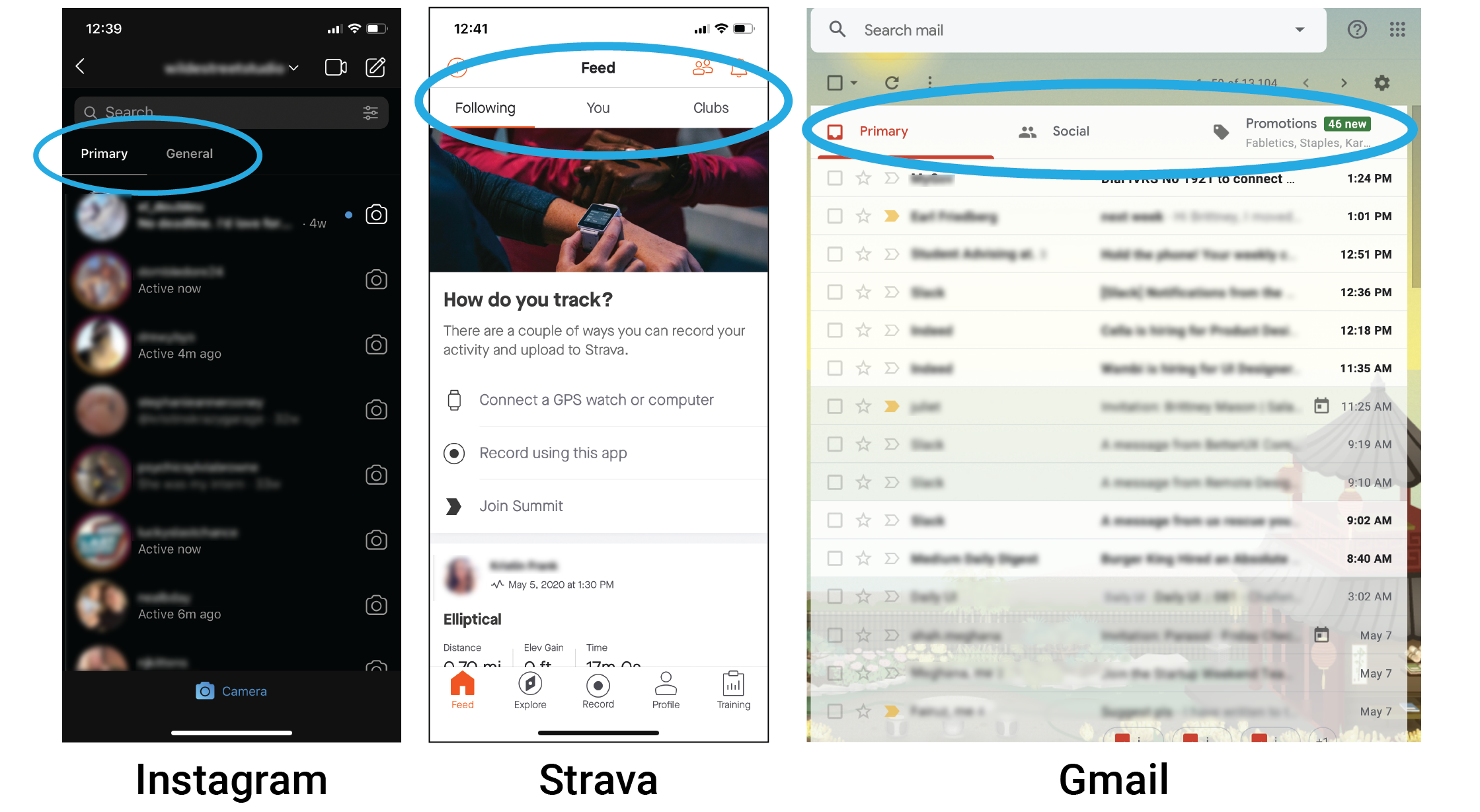
Comparative Analysis
Getting Inspiration
I needed to determine what would live within the messaging feature in order to know where to start. I discussed the client’s idea with them in detail, and also looked at other apps to get ideas for what sort of features they incorporated into both messaging and notification areas.
Some of the apps I looked at for inspiration were:
Instagram
Facebook Messenger
iMessages and iPhone
LinkedIn
Strava (fitness)
Peloton (fitness)
As I looked through these apps and how they handled their messaging and notification features, I started to discover some features that I thought were interesting, and which might be interesting to incorporate into Solin’s new feature:
Action Buttons within Notifications:

Brief bio of person(s) you’re connecting with;
other “housekeeping” options:

Tabs separating different streams of content:
Ideation & Mind Mapping
Through discussions with the client, looking at other applications, and brainstorming, I tried to come up with a bunch of ideas for possible features that would exist in and around a messaging/notification center.

I also decided to try a mind-mapping exercise to get the ideas organized, and visualize how they would be nested together:

User Flows
Inviting Friends to Work Out
In addition to regular messages between users, and messages from Solin regarding updates, etc., the main interaction in the messaging feature that the client was interested in exploring was the ability to have users invite friends to workout with them. They were not sure how to implement this feature, and so I began to explore!
The first thing I thought about was how the ability to invite friends to workout would have to include not only one, but three potential user types: the user sending the invitation; a user receiving the invitation who has a Solin account; and a user receiving an invitation who does not have a Solin account yet. I thought about how these users would interact, and created a user flow showing that interaction so that myself and the client could understand what was happening a little better.
Basically, User 1 would have to send an invitation, and then a User 2 (no account) would receive a text message saying they received an invitation to workout, with a link directing them to download the Solin app. They’d create an account and log in, where they’d see their message and accept/decline. User 3 (has account) would simply receive a message within the app, where they could accept/decline.
Questions
The user flow did bring up some questions that I felt might be worth exploring.
How should we handle people’s availability?
What if user 2 can’t do the workout at 1pm, but can do it at 2pm? Can they propose a different time?
Should the inviter send a request to choose from a few different times?
What about recurring workouts?
Can a user schedule a workout to be recurring?
Does it then become recurring for all participants?
Wireframes
Keeping everything I learned and my questions in mind, I began to do some sketches…

…and create some wireframes in Figma that I could share with the client.

Hi-Fidelity Mockups & Iterations
More Constraints
After going over these wireframes with the client, it was brought to my attention that they did not want the users to be able to freely write text, instead they wanted to only allow the user to choose from 3-5 pre-set template messages to send, at least in the early versions of their messaging feature.
This raised some questions for me, such as:
Why do you want to limit users’ ability to type to each other or limit what they’re able to say?
What messages would be included?
What if people keep going back and forth - at what point would they be recycling the same messages and run out of new things to send?
I brought up these concerns to the client, and they appreciated my input and realized the limitations that this route would have on the product, but wanted to move forward with the templated messages in their early version as they felt it was the easiest way to roll out the new feature.
How to Include Templated Responses
I started to think about how exactly this would work, as it was not the typical way that a messaging feature works. This was actually great, since it gave me a fun opportunity to explore something that I wasn’t expecting!
I took a look at some other products to get ideas for how this sort of feature would work - and honestly didn’t find too many products that did this sort of limited messaging!
The client specifically mentioned the Robinhood app, which allows the users to choose some pre-set questions:

The presets in this example seemed like they might be an outgoing message, and I wanted to make sure
that we had more of a clear separation from the conversation and the pre-set messages.
Hi-Fidelity Mockups
I created the first version of hi-fidelity mockups and a prototype in Figma, making sure to incorporate the changes that we discussed, as well as the templated message responses.
Messaging Home Screen
In my original wireframe, I had each notification from Solin come in as a different message. It quickly became apparent that this method was not efficient, and that it would be better to have all messages from Solin come in through the same thread. Users won’t want their inbox getting filled up with mostly messages from the app itself. This is also reflected in many other apps, such as Apple iMessages. In iMessage, when a business texts you about an account notification, or to send a security code, these always show up in the same thread, not separate threads. It was simple to change that in the message home screen for Solin.
I designed a basic messaging home screen that was modeled off of Instagram, as the client very much wanted theirs to appear like Instagram’s. At this time, they were not interested in having additional features such as stories, seeing if a user is online, or action buttons within the message preview - but I included an option for that so that they could roll that out in the future if desired.

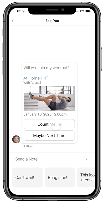
Receiving a Workout Invitation: V1
In the hi-fidelity versions of the messaging feature, I included photo previews of the workouts, and did not include the option for the invitee to propose a new time, since the client wasn’t ready to enable that feature yet.
I also explored two different options for how the templated messages would appear: a pill-shape or a rectangular shape that would scroll horizontally to reveal more options. The user would be able to expand the box containing these messages, and select one to send.

Receiving a Workout Invitation: V2
For the second iteration of the messaging feature, the client requested the design be a bit more clean/simple. We changed the color of the message boxes, so that the incoming messages were white with a grey outline, and outgoing messages were light blue. In addition to the user’s outgoing messages being light blue, every other action that the user performs also shows up in the same light blue, including the buttons they select when accepting/declining an invitation, and the buttons they select when sending a pre-set message.
In V1, the message originally comes from Solin, telling the user that they’ve been invited to a workout. Then, once they accept the invitation, the message transitions to being between the user and their friend, rather than the user and Solin.
In V2, we changed that so that the messages come directly from the friend from the beginning, and not from Solin. The idea was that users will be more receptive to opening a message from their friend, than one from the app. One of the messages that Solin had previously sent was a confirmation of the workout being added to the user’s calendar. Now, instead of that coming through as a message, it shows up under the date stamp in the area outside of the message bubbles.

Questions
After seeing this in action, I realized that one big question had come up for me:
Should the messages be sent instantly upon tapping the pre-set message selection?
What if the user accidentally touches and sends a note without meaning to? What if a user isn’t totally sure they want to send one yet? Should we just let the user be surprised when their message sends instantly, with no other feedback?
I decided to explore some options where the user would tap the note they want to send, and be presented with a “send” prompt; they would then have to click the word “send” to follow through with sending:
Option 1
The send button appears over the original button selected, so the user
essentially has to press the same button twice to submit their note.
Option 2
The send button populates above the note selections. Where it once said “Send a Note”,
it now appears as though a user has entered text into a traditional message text field,
with the send button on the right side, as it is in most messaging features.

Decision
I decided that option 2 made the most sense. Not only does it have a familiar layout that is similar to most other messaging apps, it allows for future growth.
When the client is ready to enable users to freely type text, the “Send a Note” field could become where a user would enter that text, and the send button would remain on the right side. When rolling out that update, they would also be able to keep the templated responses below the text input field, so the user would have the option to type their own text, or send a templated response.
Receiving a Workout Invitation: V3
This is the final version that we left off with at the end of this project. The client realized that most of their trainers upload photos in a vertical format, so they needed to change the workout preview to a vertical orientation. To save space, we made the accept/decline buttons smaller, and side-by-side. The “accept” button text is in blue because this is the action that we want them to perform, and making it the brighter blue color makes it more inviting to click on.
In addition, the pre-set message bubbles at the bottom were made a bit shorter, so that this overall area will take up less space on the page overall.

Here is the final messaging feature interaction!

Visual Consistency/Style Guide
Style Guide
One of the final deliverables I provided to the client was a style guide that included some of their existing components, as well as the new components that I created.
When I first came on board, they didn’t have a formal style guide, and did not have paragraph/color styles set up in their Figma workspaces. There was about 13 different font styles that I was able to identify throughout the app, and the colors were all grey tones combined with their Solin blue. I felt that their buttons were mostly too small, with the exception of one that was very large.
Solin’s Old Design System

Over the course of the project, I took a look at all of the fonts they had and reduced the number of font styles from 13 down to 6. I also added a number of components, and gave a visual refresh to existing buttons. I also made sure to make the area around arrows and buttons have a minimum tap area of 44x44px, as is best practices. I included all of these items in a new refreshed style guide.
Solin’s New Design System with Messaging Components

Conclusion
During our collaboration, Solin treated me as a full team member and thought partner with regard to their product, and ended up very happy with the work that was done and the new ideas and features that we came up with together. The success metrics that we discussed at the beginning of the project were met, and included making the app tie together more cohesively, making the visual design uniform throughout, and implementing new features.
Recommendations
Going forward, I recommended that Solin do some user interviews after rolling out the new features, so that they can make sure that all of our discussions made sense. The scope of my involvement did not include user interviews, but I made sure to note that we wouldn’t know if our ideas were valid until that happened, and that everything we were implementing was based on research and assumptions.
Results
Overall, I learned a lot about working with a product that was quickly changing. Over the course of the month that I consulted with Solin, we changed gears a number of times, and priorities for the stakeholders were frequently changing. I had to navigate those changes while keeping organized and focused on doing the best job I could for them.
At the end of our time working together, they let me know that they were planning to implement some of these updates in their next launch in a few weeks time, and also address some of the pain points that I had pointed out.
I would definitely call this collaboration a success!