Introduction
THE PROBLEM
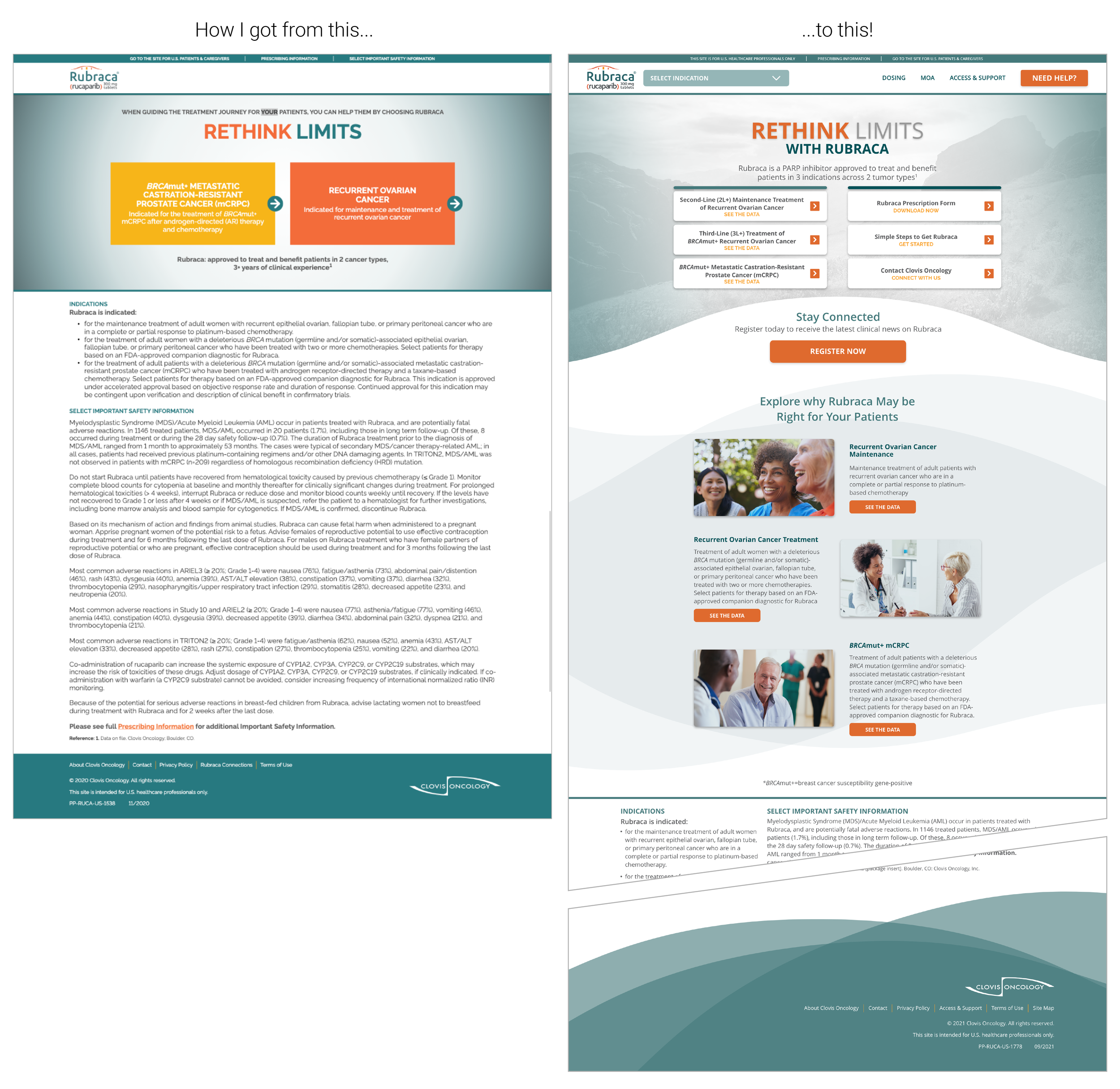
The client’s existing website, RubracaHCP.com, needed to be redesigned.
The current site objective was to give HCP’s (healthcare providers) information about the drug, teach them about the types of conditions it could treat, and explain why they should want to prescribe this drug.
It was discovered through the client’s research that HCP’s do not actually come to this type of site for that reason.
OBJECTIVES
Our assumption was that HCP’s do not want to be told that they don’t know something - they are the experts in their field already. Rather, the HCP that comes to this site already knows all about the types of cancer this drug treats, is aware that the drug exists, and just needs prescribing information in order to get patients access. They don’t really need to be “selling” the drug to most HCP’s.
Based on this, our goal was to do a full site re-design with the ultimate goal of getting HCP’s to contact Clovis or work with them to get patient access. Additionally, the site needed a new visual design style.
OUTCOMES
Awards; client happiness; still working on updates
My Role
UI/UX Designer, Visual Designer
Project Type
UX Consulting
UX/UI/Visual Design
Content Mapping
Project Timeline
4 months
Tools
Adobe XD, Adobe Illustrator, Miro
Site Audit & Content Mapping
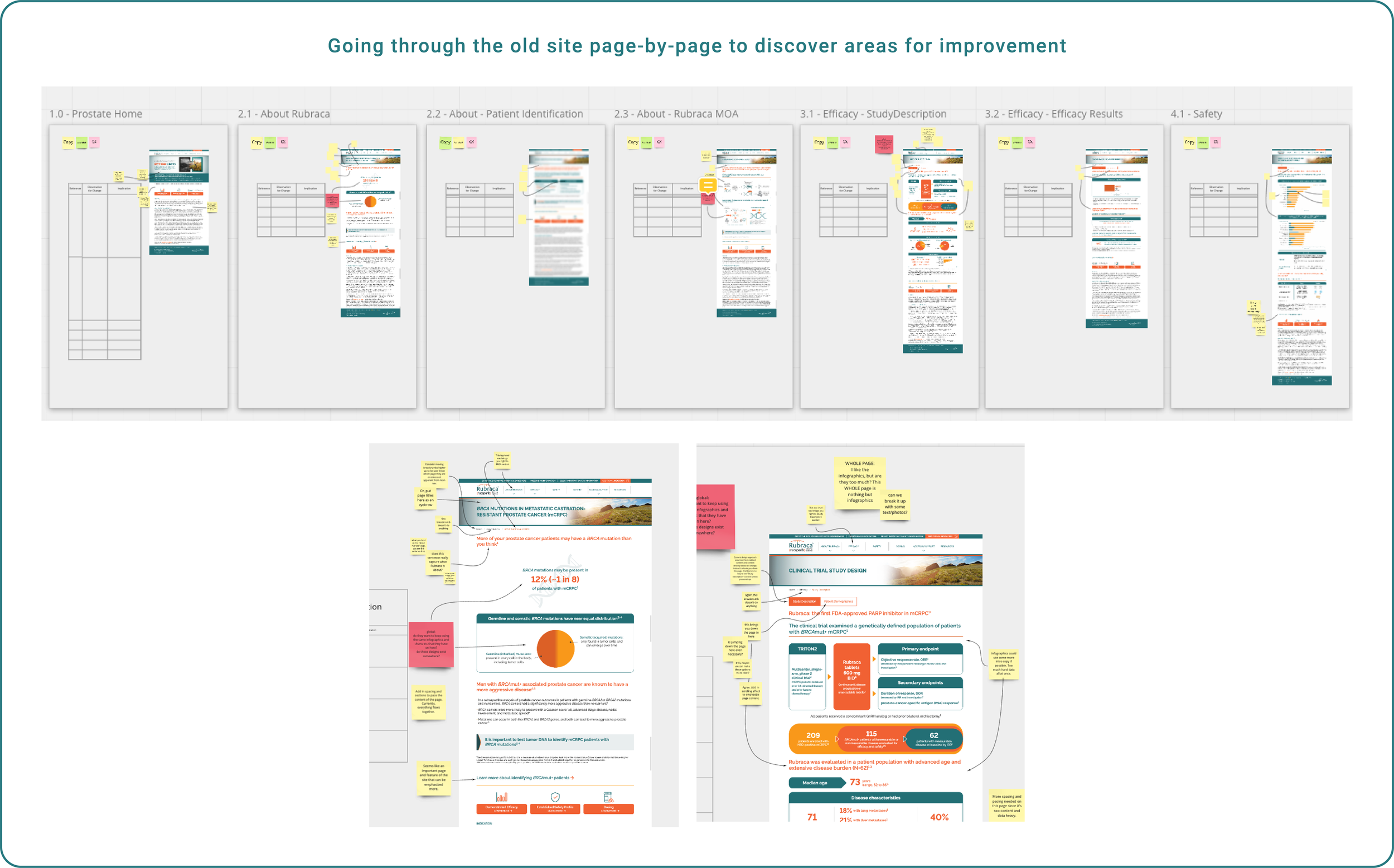
The first thing I did was perform a UX audit of the existing site. I created a Miro board where I added screen shots of all of the existing pages, and went through the old site page-by-page identifying areas that needed improvement.
Organizing Content
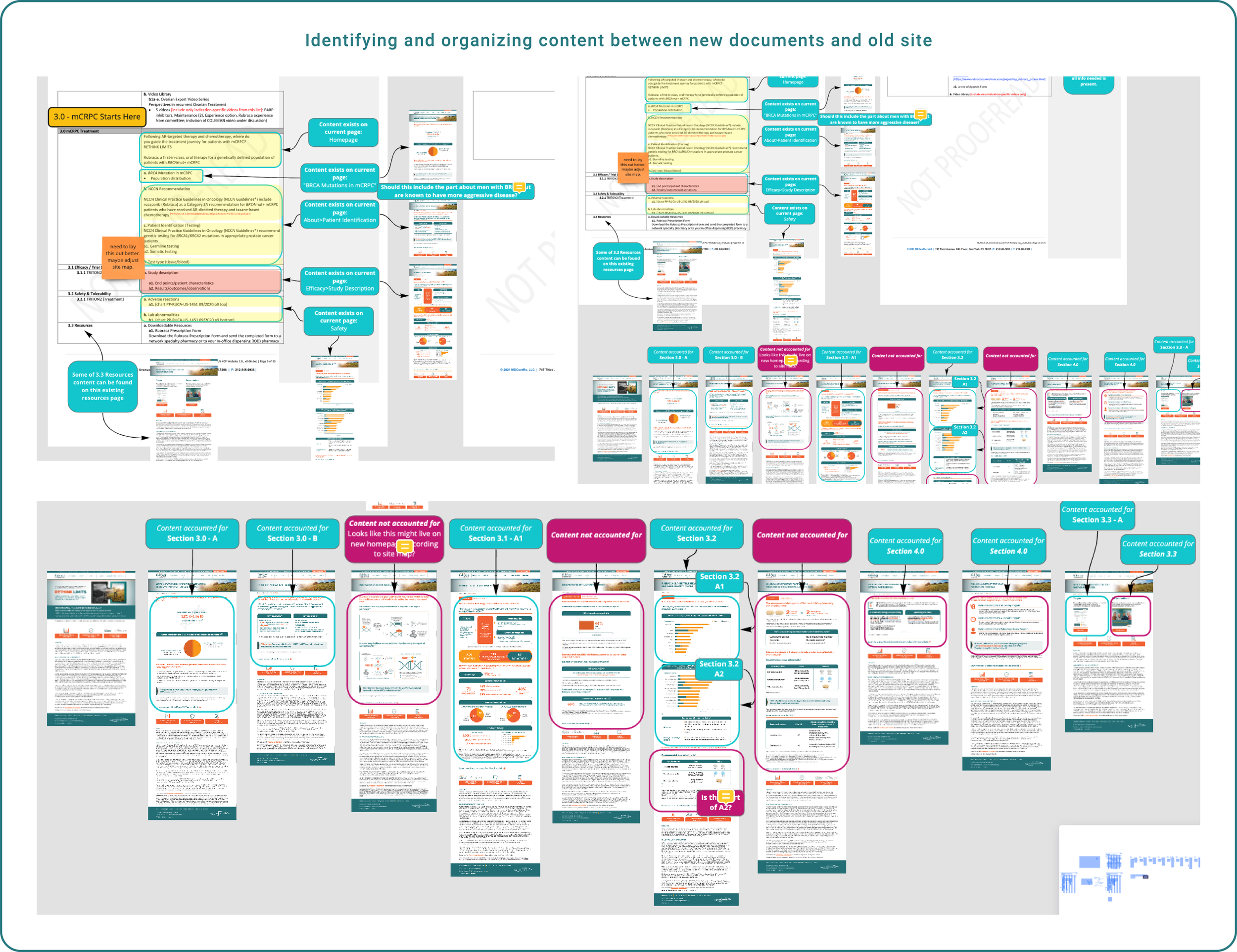
The client had provided an outline of the content that they needed to include, but it was not a full manuscript, so I had to hunt for the content. I started by “backwards engineering” their existing site by creating a content map. I planned to use this as a way to visualize the entire site, and what content would live where.
I spent a lot of time going through the outline and identifying which content already existed on the site, identifying which content did not exist or was not accounted for on the new site, and re-organizing all of the content.
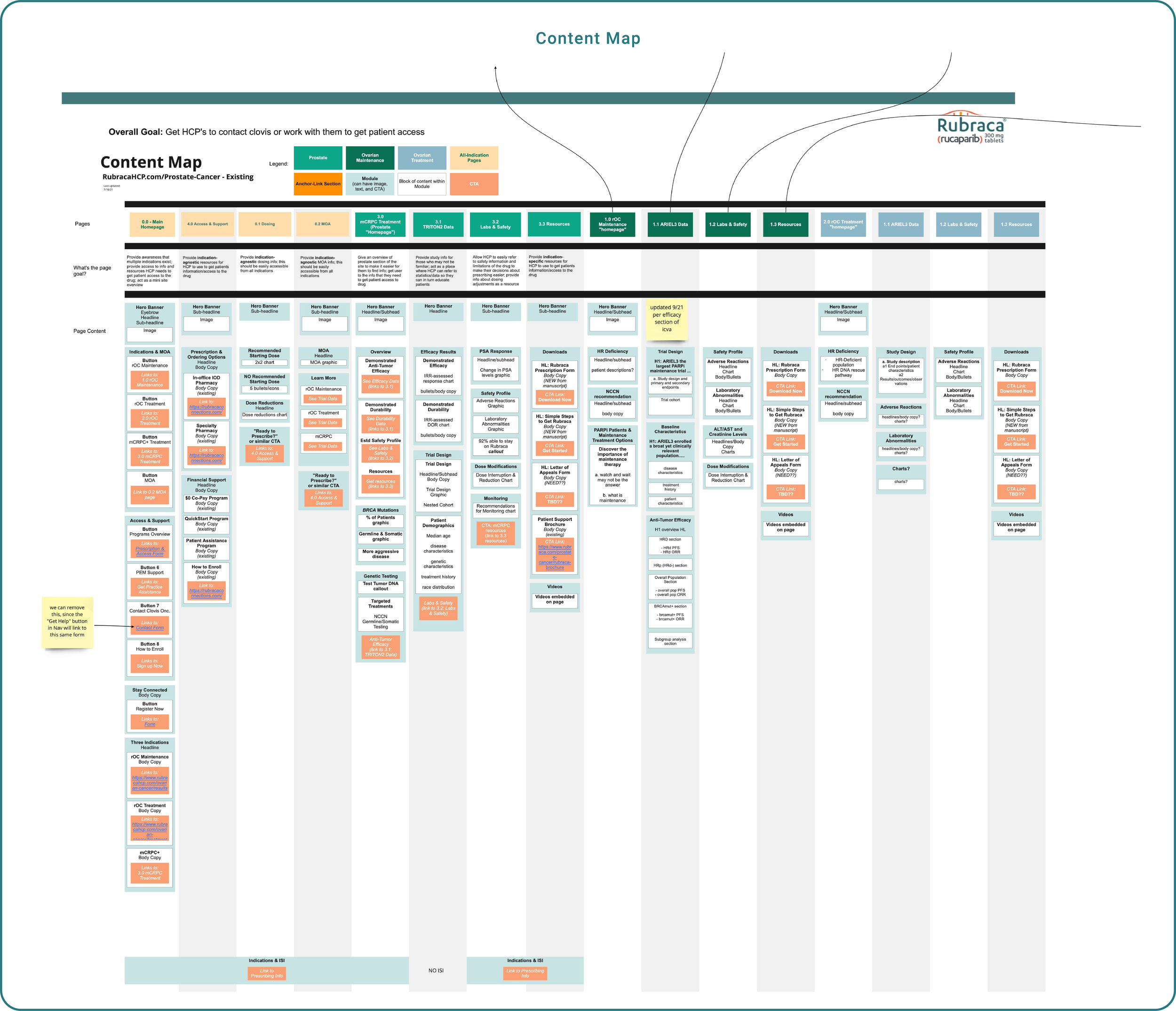
Content Map
Once I had all of the content accounted for, I created a new content map. I outlined the goals of each page, re-structured the content, and decided on CTA’s to drive the user forward, all while keeping the user’s journey through each page in mind.
I like to think of the content mapping exercise as a sort of “mini-wireframe” - which was especially helpful considering we were not scoped to actually create wireframes for a lot of this site’s pages due to tight timeline for this project.
Design
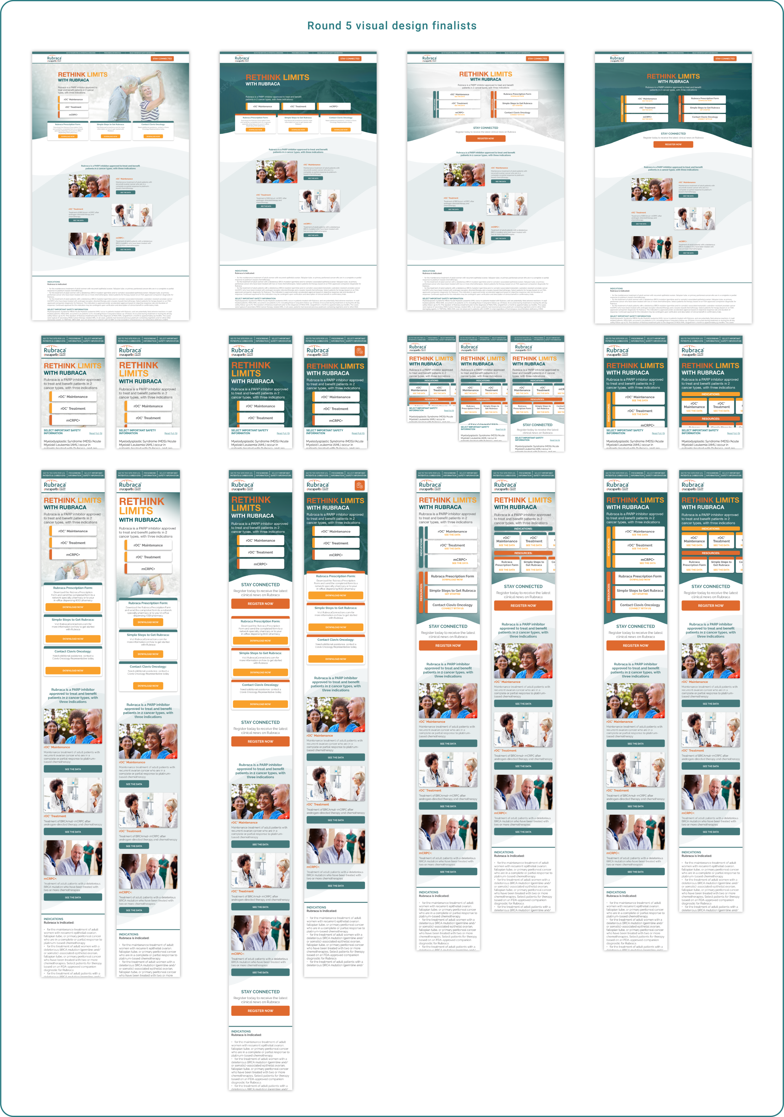
The catalyst for having the site redesigned was that Rubraca had recently been approved for a third treatment indication, where they previously only had two. The client asked Relevate Health if we could redesign the layout to include a third block in the hero that could link to that new, third section of the site for the new indication.
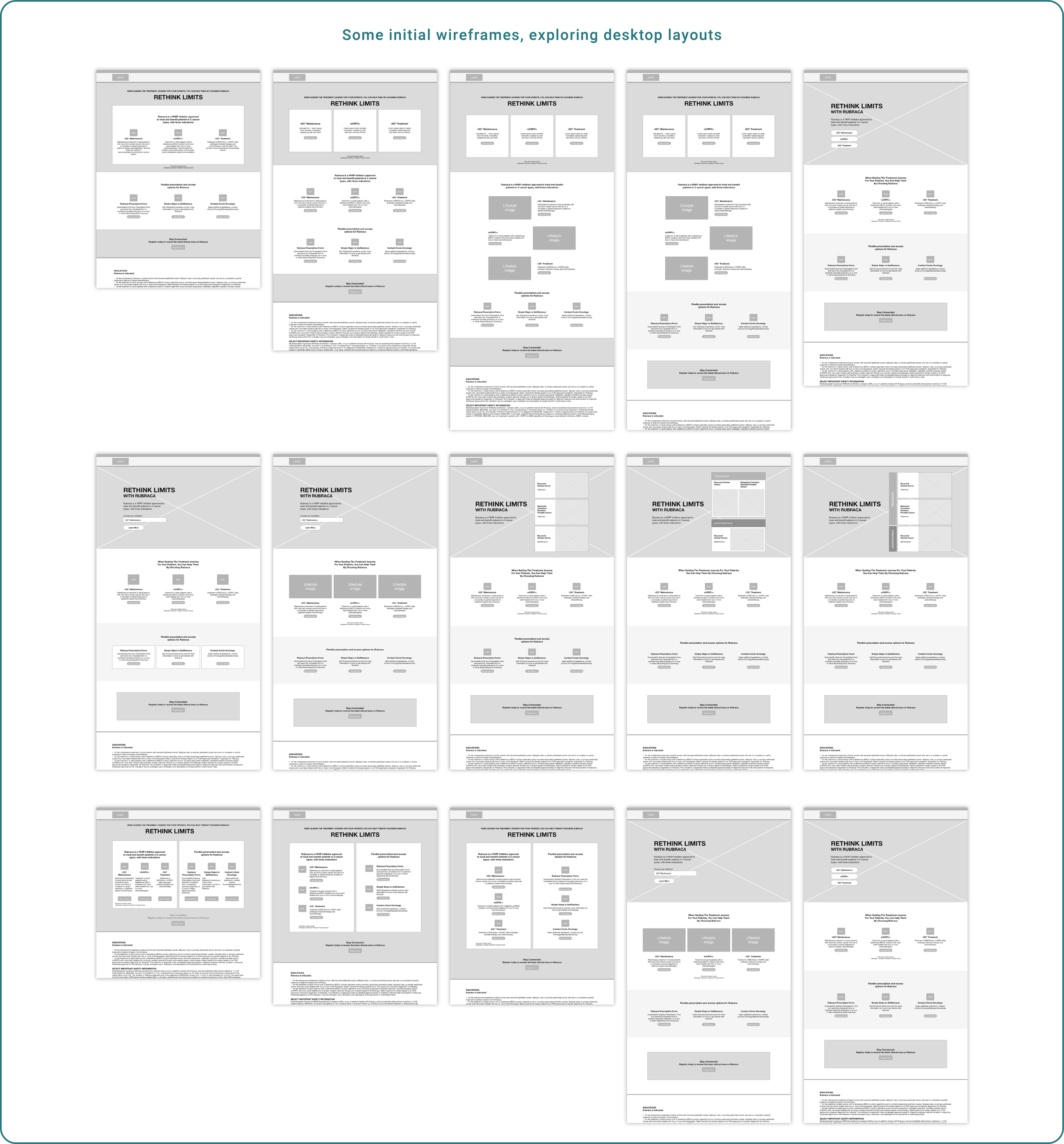
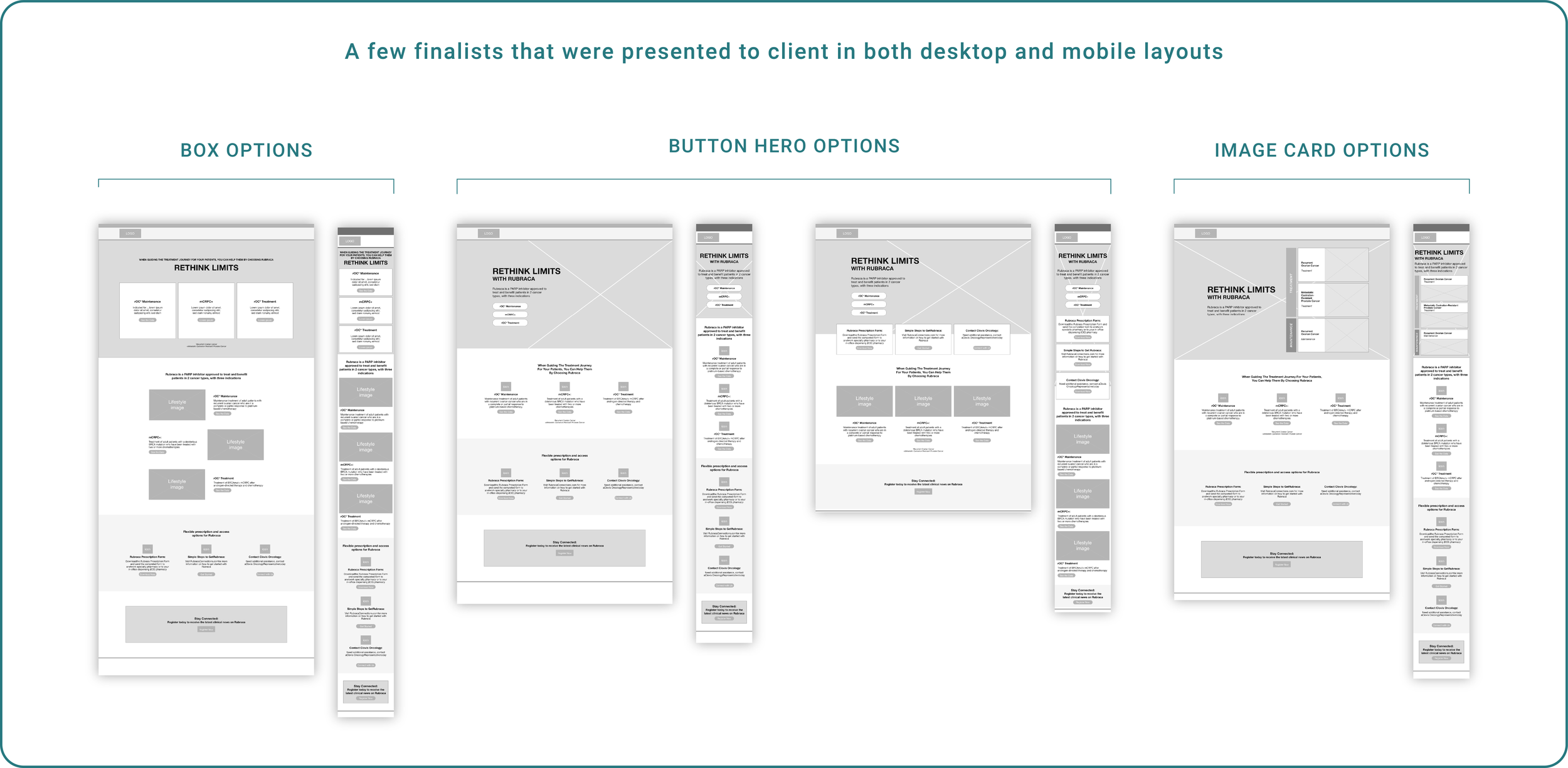
Wireframes
The client had specific content and requests, at the onset of the project. However, there were times when what they thought they wanted did not actually translate well to the layouts or to the user experience. Several times, I had to present my logic for why something would or would not work, as well as many wireframe options, to my internal team and to the client before we moved forward with a direction.
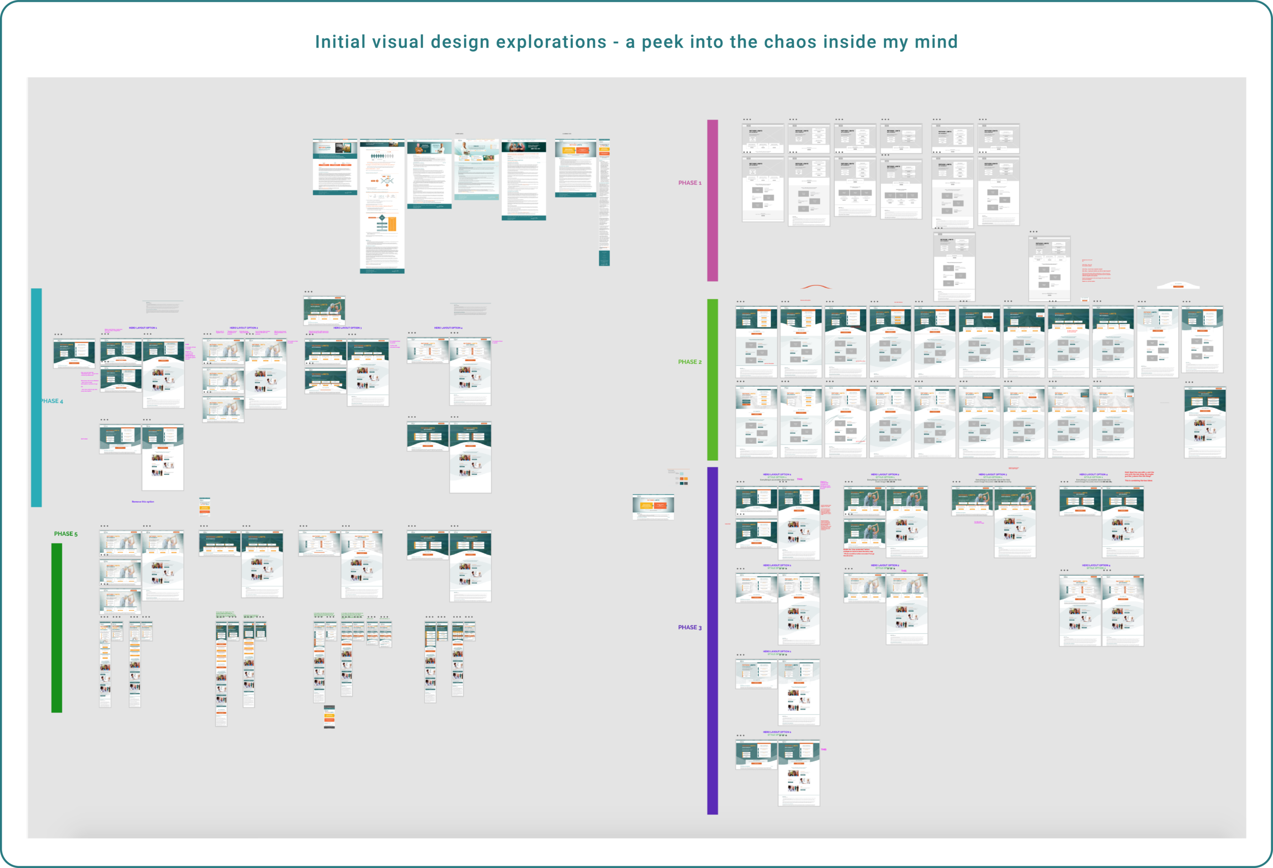
Visual Design
As mentioned above, part of the ask for this project was a complete visual re-design of the site. They wanted to update the look and feel, which would also help make the site more user-friendly. The client had another agency who they used for most of their branding, but we had full control over the new visual design of the site. I would be working with the partner agency to get charts/graphs and other assets - but other than that, it was total free rein for me to come up with a new visual treatment!
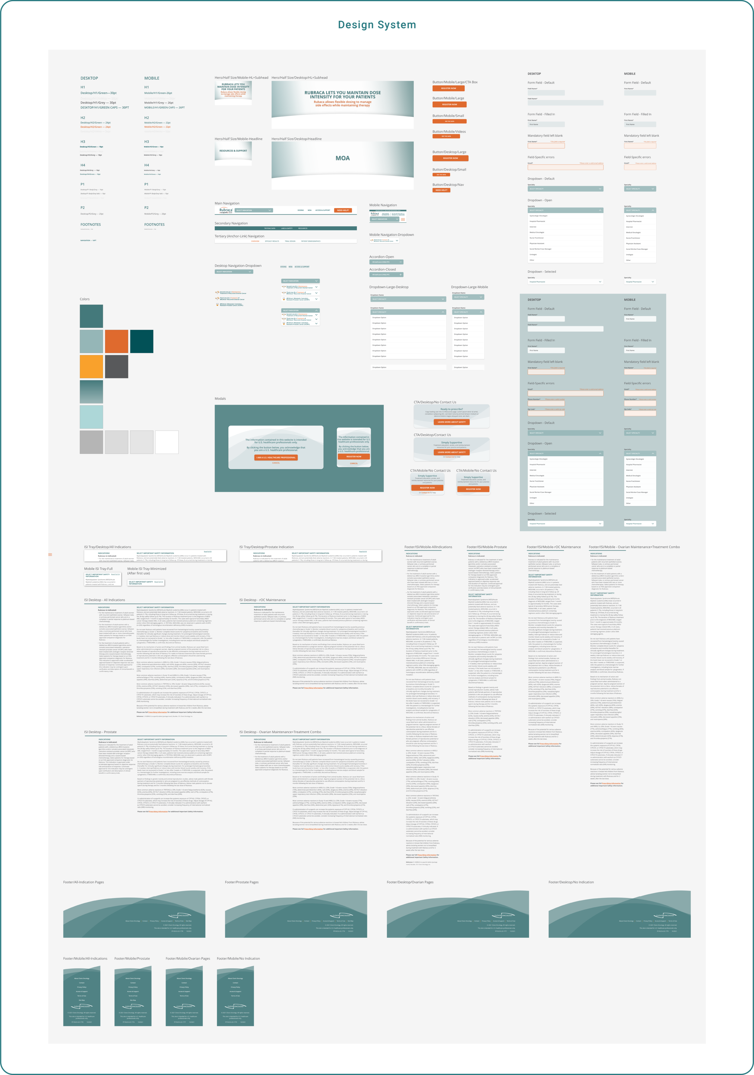
DESIGN SYSTEM
After presenting several rounds of design explorations to the client, and deciding on a direction for the visual design of the site, I developed a small design system to use for the remainder of the site design.
FINAL DESIGNS
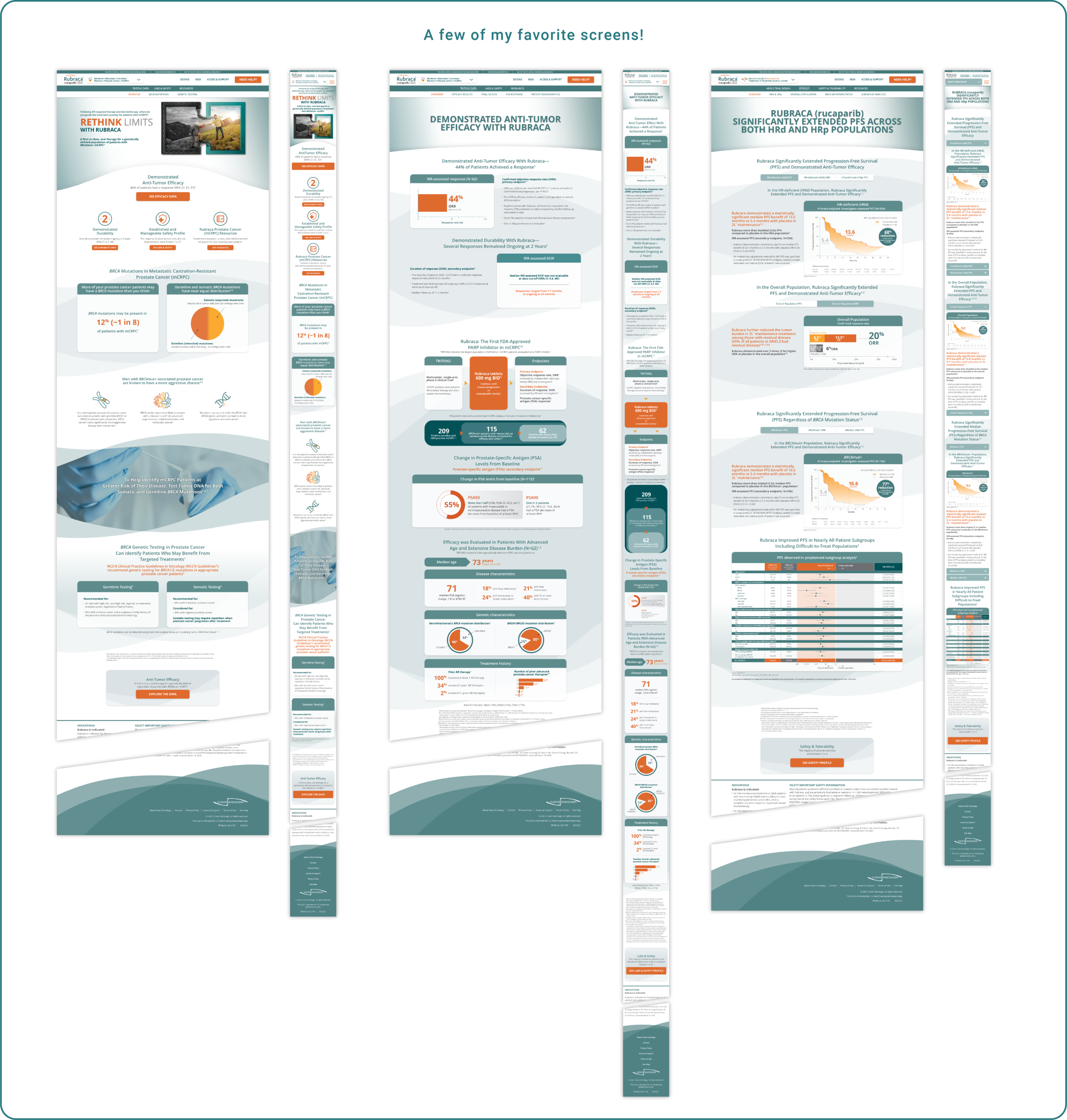
The first version of the site that we released ended up being about 18 pages. My favorite pages typically included features that were challenging and required trial and error to figure out solutions for.
Challenges I faced
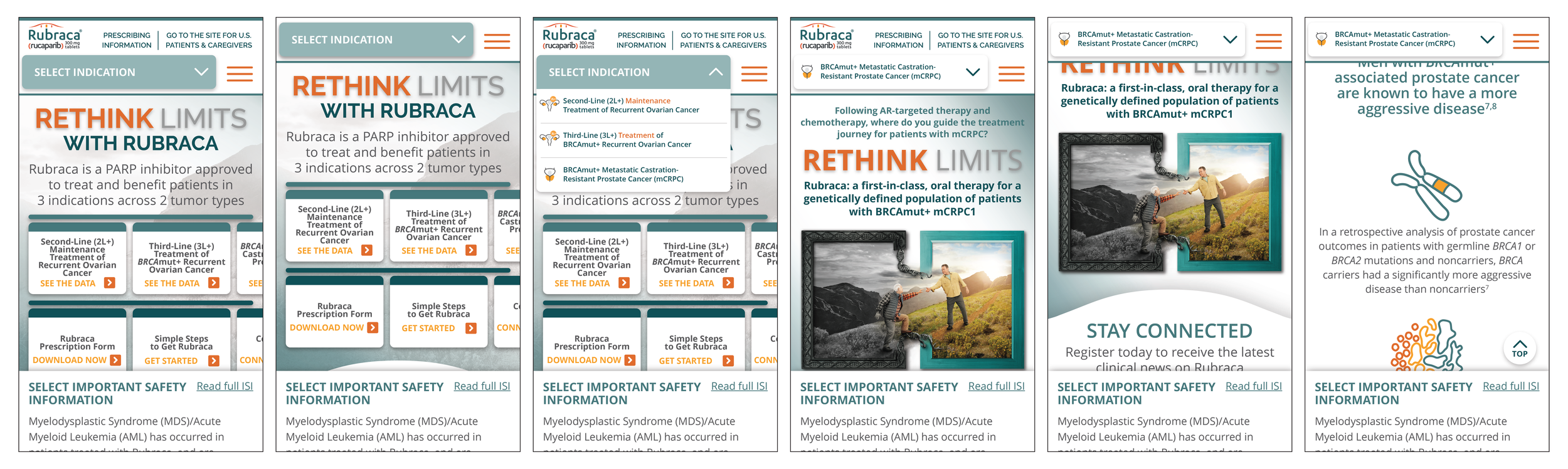
The client wanted the user to be able to change between the different site areas easily and seamlessly - however, due to legal restrictions, we had to use very long copy for navigation items. The solution to this ended up being a dropdown that would enable the user to change between the site areas. This was a good solution, however it presented its own problems with how it would work on mobile and on the back end. I went through a lot of explorations for this feature alone, as well as many meetings with the dev team.
The viewport sizes were restricted due to the ISI (important safety information) that needs to be displayed at all times at the bottom of pharma websites. It was frustrating having this restricted area and feeling like I was SO CLOSE to being able to fit everything - and yet not being able to, and having to go back to the drawing board to figure out a better solution. I do think that this resulted in an awesome solution for mobile, which was the horizontal scrolling buttons in the hero space which bring users to the 3 different site areas.
I was working with a partner agency who was in charge of creating the chart visuals. However, they did not consider website use when they designed them - and they especially did not consider the mobile treatment. I had to re-design many charts, and had to adapt all of the charts to work on mobile. This was definitely challenging because I had to ensure that the data was still being represented accurately, and there were a lot of complex charts, so it was very time consuming. I did, however, very much enjoy this process!
END RESULTS
The client was over the moon with this project. It met all of their expectations and delivered on everything they had asked for.
The project was submitted for and won a Marcom Gold Award! 2021 Marcom Awards | Category: Digital Media | Website | Medical