
Introduction
The following project illustrates my design process and solution for a fictional company called House2Home. The client needed a solution quickly, so I was tasked with running a modified GV design sprint over the course of five days. (This was a modified design sprint created by BiteSizeUX.com).
House2Home is an online retailer who sells home decor items and accessories. Their most popular items are framed prints, posters, pictures, lighting, and small decor items. The price range for most of their items falls between $10 - $50.
PROBLEM
Through customer surveys and research, House2Home discovered that many of their customers have just moved into new homes or apartments, and feel overwhelmed when trying to decide what to buy to decorate their new spaces. This ultimately results in customers abandoning their shopping journey altogether.
SOLUTION
House2Home wanted to help people who have recently moved find a “starter kit” of multiple products to decorate their new apartment. They needed to develop a website or web app that customers would be able to use on their laptop or desktop computers.
MY ROLE
I was brought on as the UX Designer and Visual Designer tasked with running a design sprint and coming up with an MVP product to launch and test with users. The client provided all research and user interviews prior to me coming on board.
My Role
UX Designer, Visual Designer
Project Type
Modified GV Design Sprint from BiteSize US
Tools
Figma, Adobe Illustrator
Day 1: Understand/Map
RESEARCH
House2Home had already conducted user interviews, and asked users to “tell us about a time you shopped for items to decorate a new home or apartment”.
After reviewing the research notes and interviews, I took notes and assembled an affinity map to organize the ideas:

The most important insights I discovered about the users are:
Users know the “look” they want, but don’t know what to buy to achieve it
Users want a professionally designed “look” - but on a limited budget
Users need a quick, easy way to find decor items
Long-Term Goal
The long-term goal of this project is to create an online experience where users can find a “starter kit” of items to decorate their homes. The experience should be quick and easy to use, and give users a variety of style options. The experience should also allow users to shop within a set budget.
How Could We Fail?
In thinking about the flow for this project, it was important to think about what NOT to do. Keeping these questions in the back of the mind during the design process would help to keep focus along the way:
What could cause a user to abandon the process before choosing products?
What might cause a user to go through the whole process, but not end up purchasing items?
What might make a user unlikely to go through the process at all?
Make a Map!
I thought about the end goal - purchasing a “starter kit” of decor items - and listed out some options showing the steps that a user would need to go through in order to reach that end goal. Ultimately, I began my design process based on the third option below:

How Might We Questions
Finally, I listed out HMW questions to help come up with ideas for this project’s solution:
How might we customize the experience to the user?
How might we ensure user satisfaction?
How might we give the user confidence that they’re making a good decision?
How might we ensure the user sticks to their budget?
How might we make the process enjoyable for the user?
Day 2: SKETCH DAY
LIGHTNING DEMOS
I started out by doing a solo version of lightning demos. I searched for similar websites or products that I could use as inspiration for the House2Home project. I decided on three: Wayfair.com, Fabletics.com, and the book “Home Body” by Joanna Gaines.
Wayfair.com
Wayfair.com is a website where you can shop for home decor and furniture. Below are some of the features that I found interesting which might relate to House2Home.

The homepage has suggestions for different ways to shop:
Department
Sale
Explore Collections
“Endless Room Ideas” where you can browse products
This page lists different styles to shop within, such as Leather, Celeb Roomovers, Nursery, Luxury, Neutral, Modern
I like that when you hover the mouse over one of their collection images, it shows little price tags on the items that are available for purchase
Then it brings you to a page where you can see the room photo up top, with some of the actual items from the photo listed below that you can actually purchase.
Fabletics.com
Fabletics sells workout and athleisure apparel. Below are some features that I thought were good inspiration for the House2Home project.

Home page has a “Start Here” prompt. When clicked on, this brings up a pop-up window that floats over the main website content and launches youinto a Style Quiz.
Answer questions about where/how you like to work out, your favorite colors, your size preferences
Once the quiz is complete, the user has a “dashboard” page that shows a collection called “My Outfits”
These supposedly are chosen specifically for you based on your preferences from the quiz.
“Home Body” by Joanna Gaines
“Home Body” is a book about home decor written by interior designer Joanna Gaines. Joanna calls the book a “guide”, and rather than telling the reader what they should aspire to, the book’s goal is to equip the reader with the tools to design a home unique to their style and needs.

The book starts the reader out with a chapter where they can identify their own personal design style
Different design styles are shown, each with a description, an image with examples, and keywords that describe that style.
Images from 22 homes are shown throughout the book. Before getting into the photos, Joanna lists each home that is featured in the book with a description, and a “Style Formula” - an indication of what style or combination of styles this home falls under
This allows the reader to decide which homes they might want to look at based on what style they want.
SKETCHING
I started out the sketching process by doing a “Crazy 8” exercise to get some ideas down quickly for the most critical screen - the style quiz.
Then, I created a quick 3-panel user flow/storyboard for this critical flow:
Day 3: Storyboarding
MAKING DECISIONS
Storyboard
I started out with looking over all of the sketches and ideas that I had come up with, and deciding which ones to use. In order to help get started, I needed to think about the user flow for this project, and created a storyboard sketch where I attempted to think through the steps the user would take.

Wireframes
I then got a little more specific by drawing up some lightweight wireframes which would help me when I started to build the prototype:

DAY 4: PROTOTYPING
VISUAL DESIGN
I spent day 4 creating a realistic prototype using Figma. I started by making a quick style guide of the fonts and colors that I would be using for easy reference.
I began by building the home page of the website with a new banner that would promote the starter kits:

MAKING ADJUSTMENTS
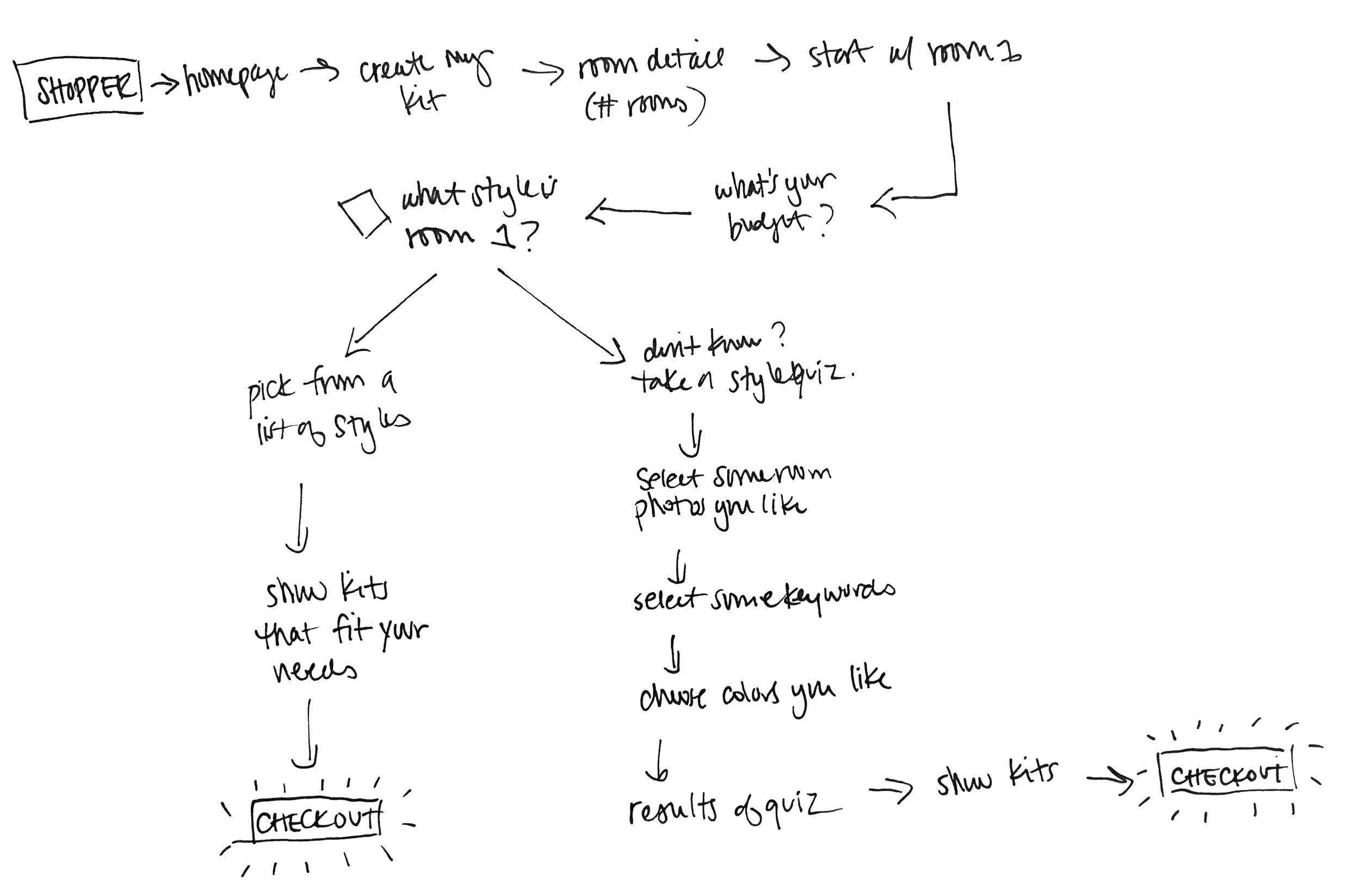
The User Flow Felt a Bit Off…
While I was working on this, the user flow was feeling a little off. I thought that diving right into the Style Quiz might turn some users away if they thought this process was too time consuming. Most of the interviews indicated that users already know what their style is, and that they want to get their shopping done quickly.
I decided to modify the original plan.
It would work better if the user first has the option to choose what style their room is from a list of styles, and then be able to take the style quiz as an option if they are unsure sure what style they are going for. I created a new user flow chart based on the new plan:
HI-FIDELITY MOCKUPS
Then, I proceeded to build out all of the screens, and make connections to create a working prototype. Pictured below are some key screen designs:


Day 5: Testing
USABILITY TESTING
I recruited five participants to participate in moderated usability testing for the House2Home website. Four of these tests were done remotely, and one was done in person. The goal was to discover any potential areas that were unclear, or problems with the user flow.
Findings
During and after each user test, I took extensive notes, making sure to note things that the user liked as well as the pain points that were uncovered, and any suggestions the user had. I then went through these notes, pulled out the most important points and compiled them into a spreadsheet. Once all interviews were completed, I rearranged the rows of the spreadsheet to group similar points, and ranked each point by priority.
The items that multiple participants mentioned were clearly the top priority to address, although some points mentioned by only one participant also seemed critical to address.
You can view the full list of points at this link, but I have highlighted some of the most important points in detail below:

Style Quiz Visibility
ISSUE:
Some participants did not notice the option to take a Style Quiz right away. The link to do this appears below the “Next” button.
RECOMMENDATION:
Move the link to take the style quiz up to the top, below the description paragraph but above the style option photos.

Budget Slider
ISSUE:
Participants were told that they could use a budget of $200. Almost every participant tried to click on the slider where it said $200 rather than slide the circle over to the 200 mark.
RECOMMENDATION:
Allow clicking to make the circle jump to the desired budget number.

Shopping Cart
ISSUE:
In the checkout screen, several users pointed out that there should be a button allowing you to continue shopping.
RECOMMENDATION:
Add a continue shopping prompt that would bring them back to their dashboard, or the home page. Also add a prompt that might tell the user they still have to go work on Room 2 before they check out.
Next Steps
The usability testing really highlighted some additional areas that need attention, but gave rise to many more questions. These areas would really need some additional brainstorming and testing in order to come to solid conclusions about how to implement changes. A few of these points are discussed below.
HOW-TO SUGGESTIONS
Users Still Might Need Help
A few users suggested that once they see the items in their kits, or even receive the items in their home, they still might not know how to use those items or where to put them in the room to get the best look. They were hoping that there might be a way that they could see some suggestions on how to use the items, or maybe a way to show you a room containing all of the items that you selected.